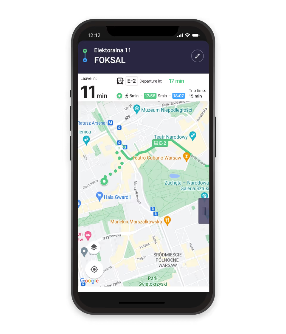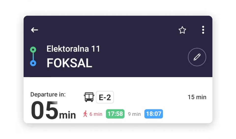
Inconsistent color coding
Green highlights the searched address and journey start, but it is also used for the bus departure time. That creates a misleading connection between different moments.
Early case study
Why was I leaving my house when I should have been boarding the bus? A curious case of inconsistency in a public transport app.
One of my first independent case studies, this is one I still return to. It helped me see that what felt like my mistake was also shaped by the interface: sometimes a product leads people astray.
The problem
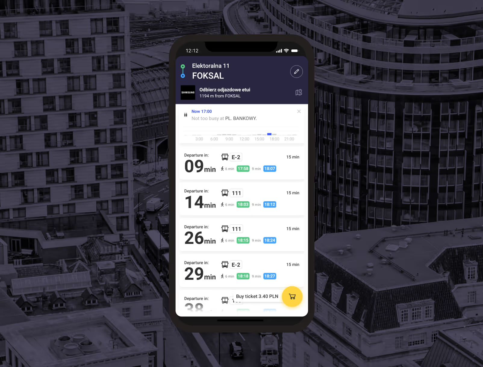
The “Departure in” label refers to when the bus leaves, not when someone should leave the searched address. Placed alongside the journey timeline, it can suggest the opposite—and leave people calculating the difference themselves.
What caused the confusion
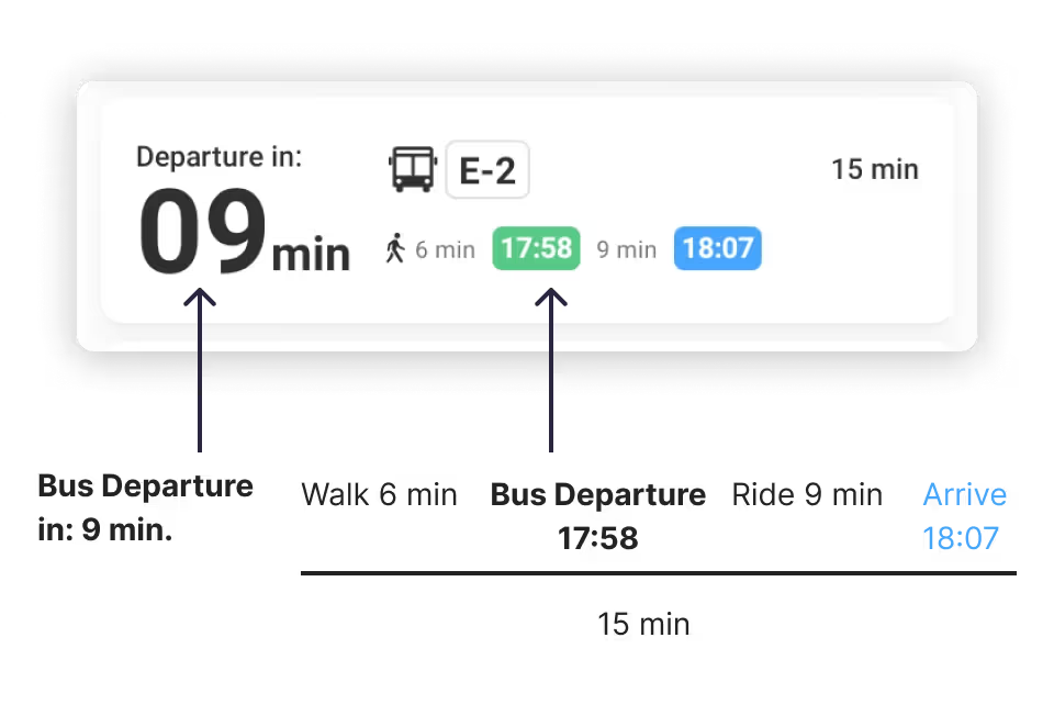
The timing issue was reinforced by color and grouping. These details mattered because each one changed how quickly the journey could be understood.
Green highlights the searched address and journey start, but it is also used for the bus departure time. That creates a misleading connection between different moments.
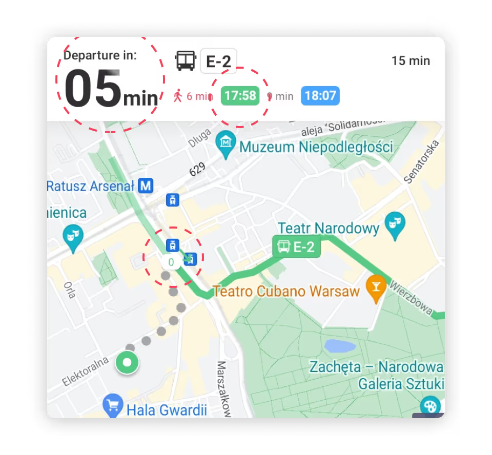
Boxed elements represent the same point in the journey, yet offer few cues to show that they belong together.
The redesign / info bar
The revised info bar changes its message with the journey: leaving for the stop, catching the bus, then arriving. The countdown and colors follow the action someone needs to take.
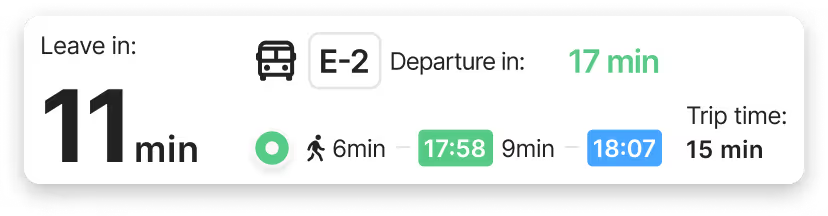
“Departure in” becomes “Leave in” when walking is part of the journey. The bus departure countdown sits beside the transport icon, and a location icon marks the walking segment.
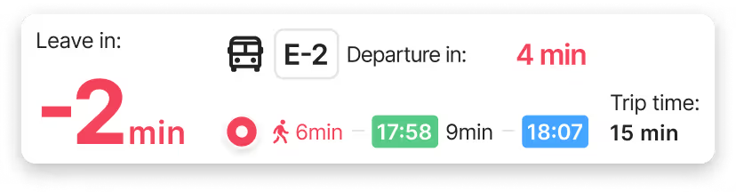
Red highlights the “Leave in” or “Departure in” time and the walking stage when someone is late. The state makes the urgency clear at a glance.
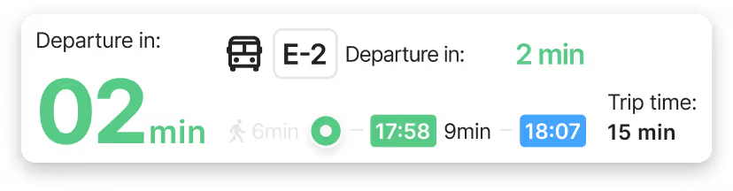
Once someone is near the stop, “Leave in” returns to “Departure in.” Green shows they are on time for the bus.
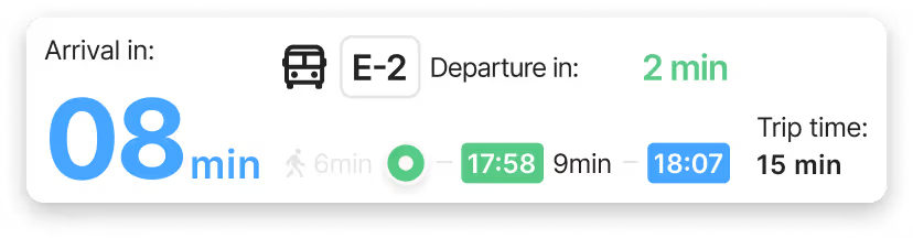
After boarding, the bar changes to “Arrival in.” The location marker moves beyond the walking phase, and unnecessary bus timing detail is removed.
The redesign / navigation
The route view follows the same color logic as the info bar. Walking, being late, boarding and arriving are easier to distinguish as the trip unfolds.
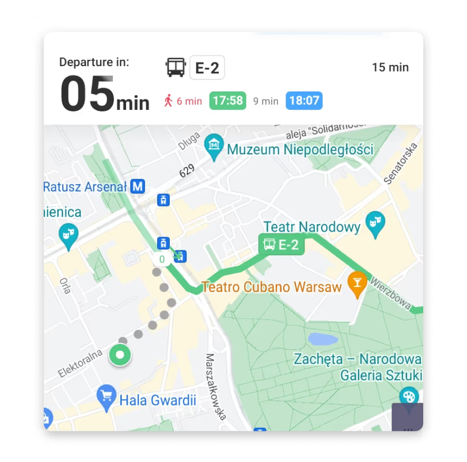
The walking route appeared in grey, visually separating the searched address from the rest of the journey.
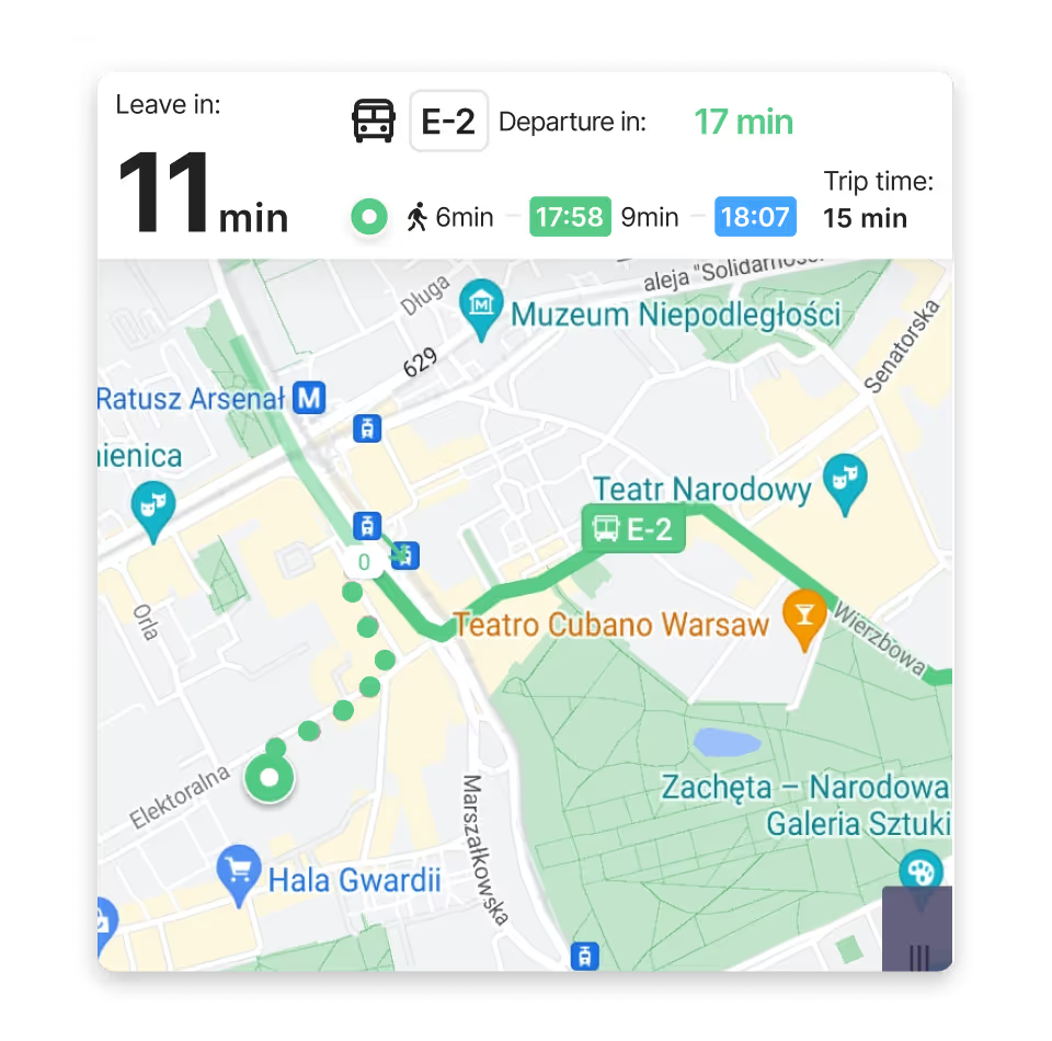
The walking route uses green, bringing the journey together as one path.
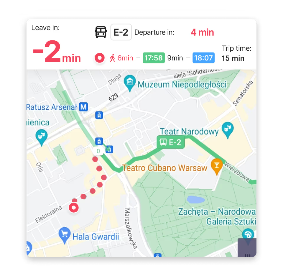
The late segment uses red, matching the warning in the info bar.
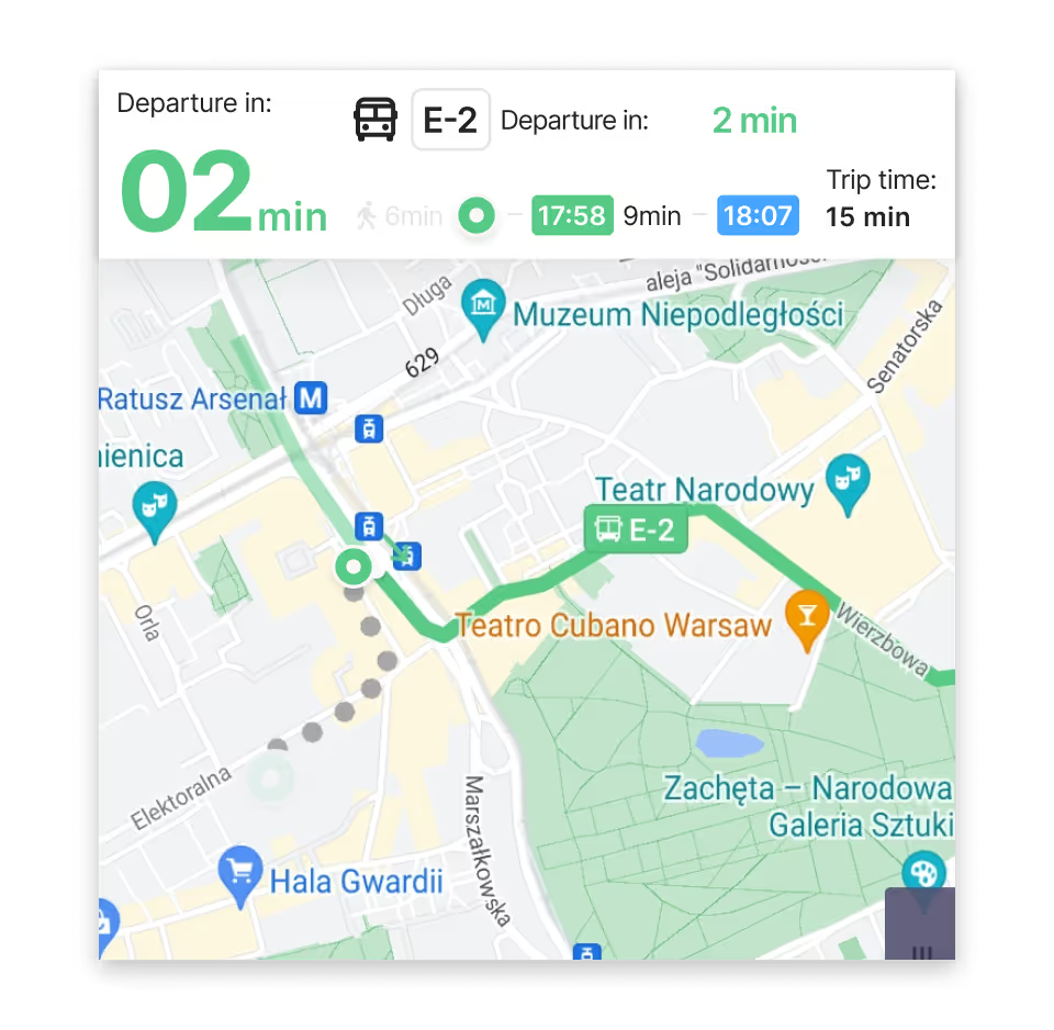
The completed walk becomes grey, showing progress through the trip.
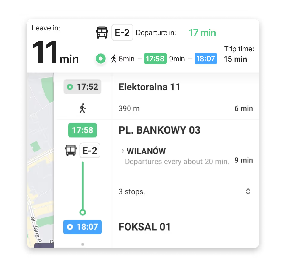
The detailed timeline is clearer when the info bar gives the correct “Leave in” time.
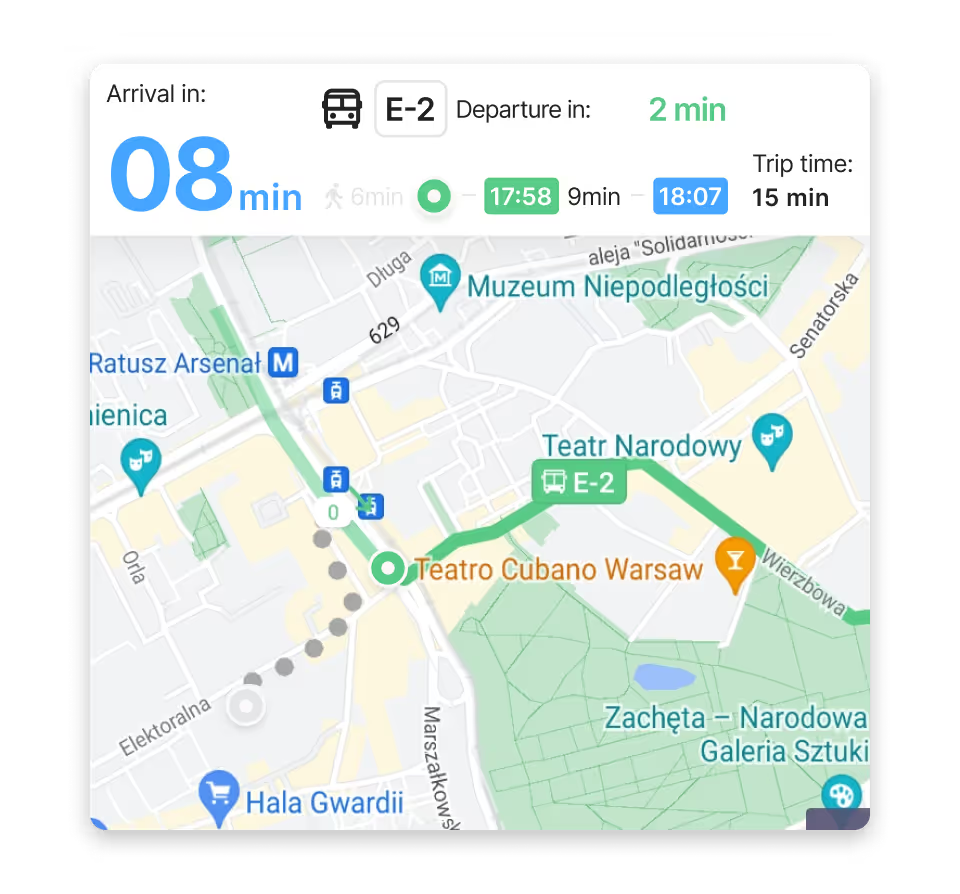
After boarding, the walk is grey and the completed part of the route becomes a lighter green.
Finishing thoughts
The departure time shown did not match the action I needed to take from my searched location. Correcting the language and connecting it to the route makes the experience easier to trust.
← All projects